February 4, 2021
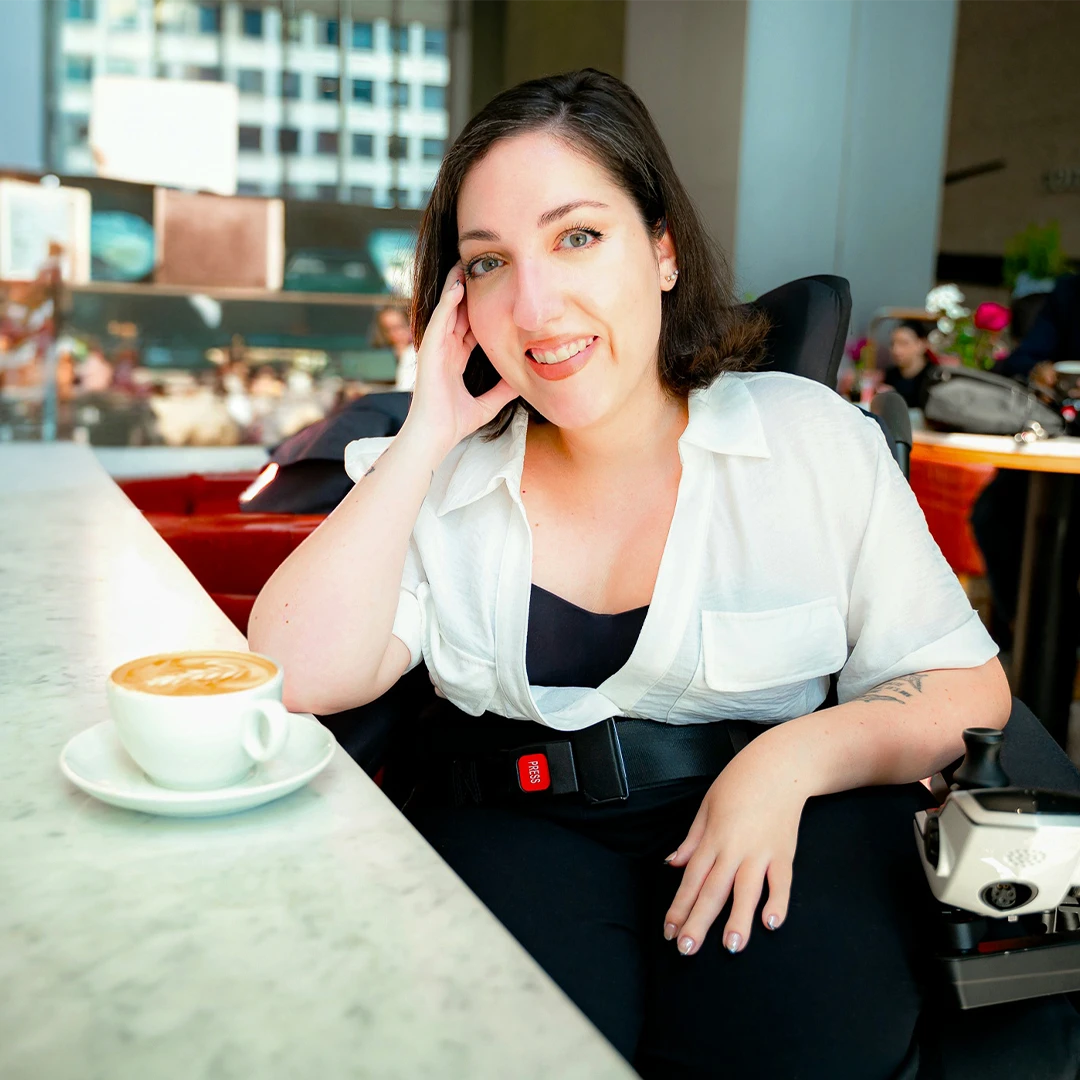
1 of 6 presenters for Practice Makes: Accessibility. Hosted by Digital Products, an Accenture Studio.
Accessible design requires both technical standards to adhere to as well as actual input and involvement from the disabled community. Authentic representation, compensation, and involvement is crucial for accessibility in design. You cannot build something for us, without us.
Accenture Presentation1 of 6 presenters for Practice Makes: Accessibility. Hosted by Digital Products, an Accenture Studio.
Accessible design requires both technical standards to adhere to as well as actual input and involvement from the disabled community. Authentic representation, compensation, and involvement is crucial for accessibility in design. You cannot build something for us, without us.
Internal page. Pre-recorded with closed captions and transcript. Q and A segment not recorded.
Speaker: Jessica Oddi in English. Approximately 22 minutes and 4 seconds. With a live questions and answers segment to follow [not recorded].
Disabled Design: Understanding Accessible Practices
Image description: Icon of an equal sign with an outer circle cut out in two places.
A Bit About Me
Hi everyone! My name is Jess. Pronouns she/her. I’m a freelance disabled designer from Hamilton Ontario, Canada. Which is situated on the traditional territories of the Erie, Neutral, Huron-Wendat, Haudenosaunee and Mississaugas.
My focus? Bridging the gap between branding/web design and accessibility from a disabled perspective.
Image description: Me smiling, sitting all cute in my power wheelchair parked on an angle outside Red Church Cafe. I am white with olive-skin, green eyes and brown hair tied back in a low bun. I’m wearing a white collared shirt, light denim jeans, and camel-coloured lace up boots.
Disclaimer
Before I begin. We need to acknowledge some things:
Accessibility Standards
Standards Are The Beginning
Suppose you’re learning a new language. You wouldn’t be fluent after taking 101: Intro to Italian. Yet you need to know those basics before you can understand the complexities of the language.
Consider accessibility standards the 101 of accessible design. It’s the foundations to start your practice. And learning them is very important. In fact I’ll be providing resources at the end of this deck for you to get started.
Disabled Design Is The Future
Knowing the basics only gets you so far. Accessibility is such an individual experience. One technique or standard might not work for everyone.
Designing for cross-disability access requires thinking beyond the standards. It requires master classes from the experts.
Who are the experts though? Spoiler alert: it’s disabled people. We’ve been adapting to environments that don’t work for us since day one. Now take all those minds, all those experiences, and all those solutions. You get a blue-print for building a better structure.
And friends, that is why an accessible future needs disability-led design!
Image description: Vector banner with bold bright colours in red, yellow, and blue. A person in a chair is holding up a banner to the left. A blind person’s side profile is in the middle. They are wearing sunglasses and holding a cane. A set of hands forming the ASL interpreter symbol is placed to the right. At the bottom right is a flag with a lightning bolt in four colours representing the disability flag.
Non-Disabled [less than] Disabled Design
Disability Dongle
“[An] elegant and well-intended, but… useless solution to a problem people with disabilities never knew they had.”
– by Liz Jackson. Source: Disabled people want disability design—not disability dongles.
This elegant term captures the essence of a non-disabled led accessible approach. It’s impossible to design something for a user without their involvement. There is a perfect example of this that resonates with me deeply.
The Stair Climber Chair
Video description: A 3 second clip of the stair climbing wheelchair by Caterwil GTS3. Text overlay reads “Safe Climbing”. The person in the power wheelchair goes up a staircase backwards. The chair shakes back and forth as it climbs.
Why It’s Not As Successful As You Think
From a non-disabled perspective it looks SO COOL RIGHT?! Finally the solution to wheelchair-users everywhere. I’m using sarcasm here.
Pump the breaks team. And that pun. Here’s a couple reasons why this actually doesn’t work for many people:
One-Solution Doesn’t Fit All
But Jess! It doesn’t work for you, maybe. What about the financially-well-off disabled people with great core strength? There’s always insurance! Or any other questions to dispute my distaste for this so-called-amazing invention.
This may very well be a solution for some! Innovative tech is cool. But this sure as heck didn’t consider a large demographic of their users. And in the end didn’t provide a solution to the inaccessibility of stairs. If one person can’t use this option, then it’s not accessible.
And that’s what happens when you design for a community without involving them. You miss very important details. Like not-snapping-your-neck safety.
My Journey into Accessible Design
The Online Origins
I’m a graphic designer, so I’m going to focus on an area I know best: online accessibility. My first intro into accessible design came from the humble days of Tumblr.
I was blogging as every edgy-creative-college student does. Do they actually? Unsure. Anyway I came across a post from one of the many disabled people I followed. It had a block of text under an image describing it.
What is this? I asked myself. But not really, because it was actually pretty self-explanatory. Text describing the image, must be for Blind folk. And since then I started adding image descriptions on social media. It was that simple.
The Evolution
The more I connected with other disabled people, the more techniques I picked up. I learned that image descriptions weren’t only for the Blind and screen-readers. It also provided more context to images for people with processing disabilities.
From the community I learned the reasons behind the standards. How to caption videos. Why captioning alone isn’t enough. That transcripts provide alternate ways for a user to process information.
I began diving into the specs. Checked recommended sources from Facebook groups. Read up on discussions online. Finding out what worked for people and what didn’t. Then adopted my own techniques from there.
The Takeaway
The accessibility practices I use now came from the community and research. They were always around me. In the disabled spaces I chose to be part of. In the depths of resources pages from one disabled-owned site to another. And going forward, they’ll change as the community finds new ways to adapt.
The takeaway? Accessible design IS community care. Specs by disabled organizations, right down to individual options. It’s asking disabled people “what works for you?”. And giving a platform for disabled-led design.
Image description: Vector banner that uses primary colours. To the left, two disabled people are looking at each other. The first person is a wheelchair user with an oxygen mask wearing a dress. The second person has an invisible disability. They have a beard and short hair. To the right, two disabled people are crossing paths. The first person has crutches and is wearing a bomber jacket. The second person has dwarfism and long flowing hair. There’s a heart in the background.
Tips and Practices
Okay we’ve made it! Thanks for following along so far. Now for the goodies I promised.
As noted, accessible standards are important. There can be some apprehension when entering this space. The fear of “messing up” or not knowing where to start. But the thing to remember is, we are all forever learning. This is an ongoing practice. Showing up imperfect is better than not showing up at all.
My own accessibility practices are present in the process, build, and display of my work. I’m going to share a few of them with you, as well as some suggestions in other fields.
The Process
Accessible Spaces
Disabled design requires an accessible environment. Get to know user preferences, from their identity to their access needs. For example, some disabled people may prefer identity first or person first language. Disabled person vs person with a disability.
Representation and accountability are important. When you don’t know, ask! And of course involve disabled people in your process throughout. Compensate us for our efforts and our valuable resources.
My Practice
When working with clients I adapt to their needs. I’m available by text, video, and phone call depending on what is easier for them. Take into consideration different learning styles.
The Build
Start With Accessibility
If you add accessibility as an afterthought, it takes a lot more work than starting with it.
Take Instagram. Their “stories” feature is not accessible for screen readers. And now it will take an overhaul to add in elements to make it so. Such as alt text additions or audio recording overlays. If they consulted with people who use screen readers from the start, they would have avoided a lot of extra work.
For product and UX/UI design, there needs to be a disabled demographic in your research. You cannot assume accessibility by standards alone. We must test with actual disabled users and assistive tech. If there’s a budget, compensate disabled people for their labour.
Testing
Whether I’m building an accessible brand or website, I test while I build, not after. There are tools – that will be in the links section – to check for a variety of access needs.
From colour contrast, to web layouts and copy. Another good test is to navigate your website by only using a keyboard. If you can’t, then it’s back to the drawing board.
A quick way to see if your content is screen-reader accessible is to turn it on your phone or desktop.
Most modern devices have a screen-reader function. Search your device’s accessibility features. On Mac computers it’s called VoiceOver under Accessibility. On my Samsung phone it’s under Settings > Accessibility > TalkBack.
Once it’s activated, go to your web page or app and try using it.
Image description: Isometric view of a desktop computer, keyboard and trackpad. A teal screen and white text reads “Screen Reader Desktop Check”.
The Display
Social Media Accessibility
Image description: Isometric view of a mobile phone. Vector banner on the screen in primary colours of accessibility features. Graphics of a “Tt” symbol, eye, and audio speaker. Document with a verification checkmark. A CC icon, frame box, and a computer screen with a wireframe layout of a website.
I display my work online. So my focus is usually on social media accessibility, especially Instagram and Facebook. A few of the basics are:
Adding Alt Text
This varies per platform. On Instagram, when making a new post go to Advanced Settings > Accessibility > Write Alt Text. Facebook desktop, upload your image then click Edit Image > Alternative Text. Tutorials for platforms are available, just search!
I keep my alt text short and to the point. What is this an image of? In one or two sentences. Alt text is code for when images break or don’t load and read by screen-readers.
Image Descriptions In Captions
Image descriptions are not alt text. These go in the captions and I like to add more descriptive context. They are there for:
Try to keep it two hundred and fifty characters or less. Describe the main point of the image in detail, then do background elements if significant. For example if you’re advertising a shirt, focus on the shirt more than the model.
Adding Closed Captions
Apps are starting to use auto-captions, like IGTV. But they’re not the most accurate. It’s also good to add audio descriptions beyond what you say. Describe what the video is, where you are, how you look.
I add captions and audio to stories in two ways.
Writing In Simple Terms
Long, convoluted captions can be exhausting to read. Keeping things in big paragraphs rather than points is also tiring.
Try and be concise with your words. I use apps like Hemingway Editor to check the reading level of my work. This also helps to use less idioms, or passive text.
CamelCase Hashtags
Capitalize the first letter of each word on your hashtag. This will allow screen-readers to differentiate each word.
Links and Resources
Let The Studying Begin
If you noticed, my presentation doesn’t contain too much tech tips. That was intentional. Part of accessible design is doing the research disabled people have done. Part of learning is by reading, listening, or doing.
There are so many links and resources for accessibility out there. And the tech side is a lot easier than you think. It requires some direction. So I’ve compiled a few on accessible design and disabled advocacy that can help you get started.
Disabled Representation
Crip Camp: A Disability Revolution: A Netflix documentary on the history of disability activism. Directed by Nicole Newnham and Jim LeBrecht.
Disability Visibility Project: An online community dedicated to creating, sharing, and amplifying disability media and culture. Founded by Alice Wong.
Black Disabled Creatives: An initiative started in alliance with the disabled community. To bridge the divide for Black creatives with disabilities. Founded by Jillian Mercado.
Critical Axis: A community driven project from The Disabled List. Collecting and analyzing disability representation in the media.
Haben Girma: The first Deafblind person to graduate from Harvard Law School. Haben Girma is a human rights lawyer advancing disability justice.
Tiffany Hammond fidget.and.fries on Instagram: Autistic mother, advocate, and storyteller. Using her personal experiences with Autism and parenting two Autistic boys. Her activism challenges the perceptions of Autism.
The Autisticats: Three autistic young adults, figuring out life. Sharing their experiences as neurodivergent people. By Eden, Leo and Laurel.
The Disabled Life: My sister Lianna and I documenting the jerks and perks of living [Hashtag] TheDisabledLife.
Design/Web Accessibility
The A11y Project: A community effort to make accessibility easy. Resources, courses, and guides.
Access Guide: A friendly introduction to digital accessibility by Alex Chen.
Mabely Q: Accessibility education by Erin Perkins, including the Accessibility Made Easy course.
Veronica With Four Eyes: Free resource by Veronica Lewis. For low vision/visual impairment and assistive technology.
Accessible Practices Overview: This is my own document with links to courses/resources including:
Accessibility Tools
Web Accessibility Checker by AChecker: Checks single HTML pages for conformance with accessibility standards.
Contrast Checker by WebAIM: Checking the contrast ratio of two colours. Note: this is not a pass/fail scenario; it’s only for the contrast. Making colours accessible needs to account for sensory as well.
Color Blindness Simulator by Colblindor: A tool to see images with levels of colour blindness.
One Click Accessibility WordPress Plugin: It can change the font size, colour, contrast, background, links, and select a readable font.
Descript – Podcasts, Videos, and Transcripts: An audio/video editor that works like a doc. Includes transcription, a screen reader, publishing, full multitrack editing, and useful AI tools.
Hemingway Editor by Adam and Ben Long: Text editor that makes writing bold and clear. Provides suggestions for understandable copy.
Thank You!
Thanks to Digital Products, An Accenture Studio for having me. Shout out to the disabled community. I’m grateful for the online spaces. And every lesson I learn from this beautiful group.
If anyone wants to chat disability and accessibility, I’m available on:
Jess focuses on disability-led practices. Balancing lived experience with community spaces in her discussions.
events + featuresA white disabled woman smiles with a cappuccino. At a counter in her power wheelchair. She has green eyes, and brown-silver hair. Wearing a white collared shirt over a black jumpsuit. Photo and editing by Garry Tran.